
ANNUAL BRANDING

Awards, Campaigns and Idea Books

Each year at CBH, an overarching theme is developed for our company's annual awards celebration. To kick things off, I create the visual identity for that theme, including its typography, color palette, imagery, and supporting graphics.

After the awards event, the branding evolves into a larger campaign used for internal marketing materials, merchandise and other agent-facing resources. Each year has its own visual personality while remaining flexible enough to work across print, digital, and event applications.

Elevate

2024 · Awards + Idea Books

Elevate branding campaign header
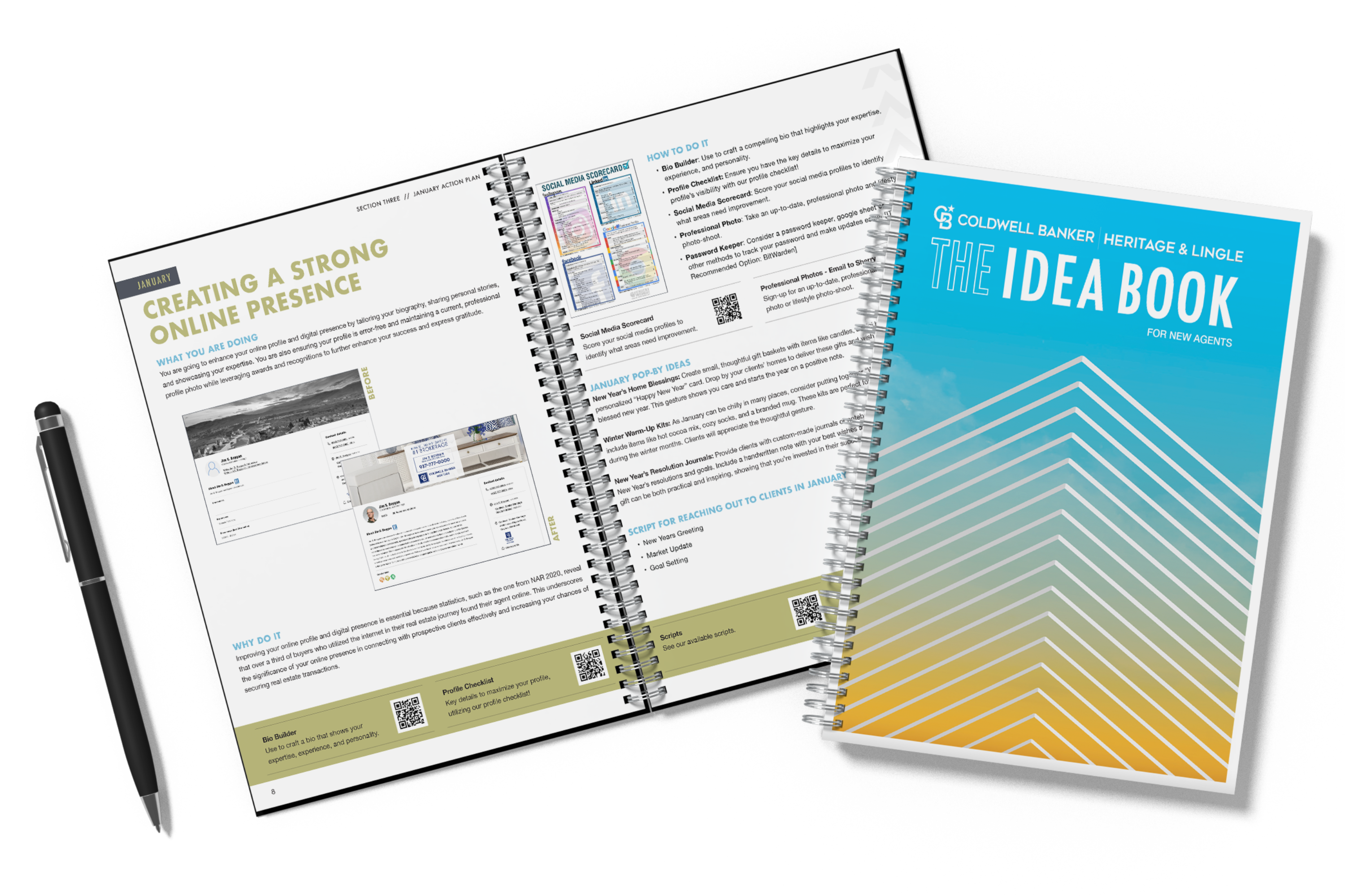
Elevate Idea Book mockup

Building the Elevate Identity

"Elevate" was developed around the idea of looking forward and encouraging agents to reach new heights.

The visual identity used gradients, sky imagery and upward-moving elements to reinforce the concept.

The branding was initially developed for our awards celebration and was later expanded into two annual Idea Books: one for agents beginning their careers and another for experienced agents working to stay at the top.

COLOR SYSTEM
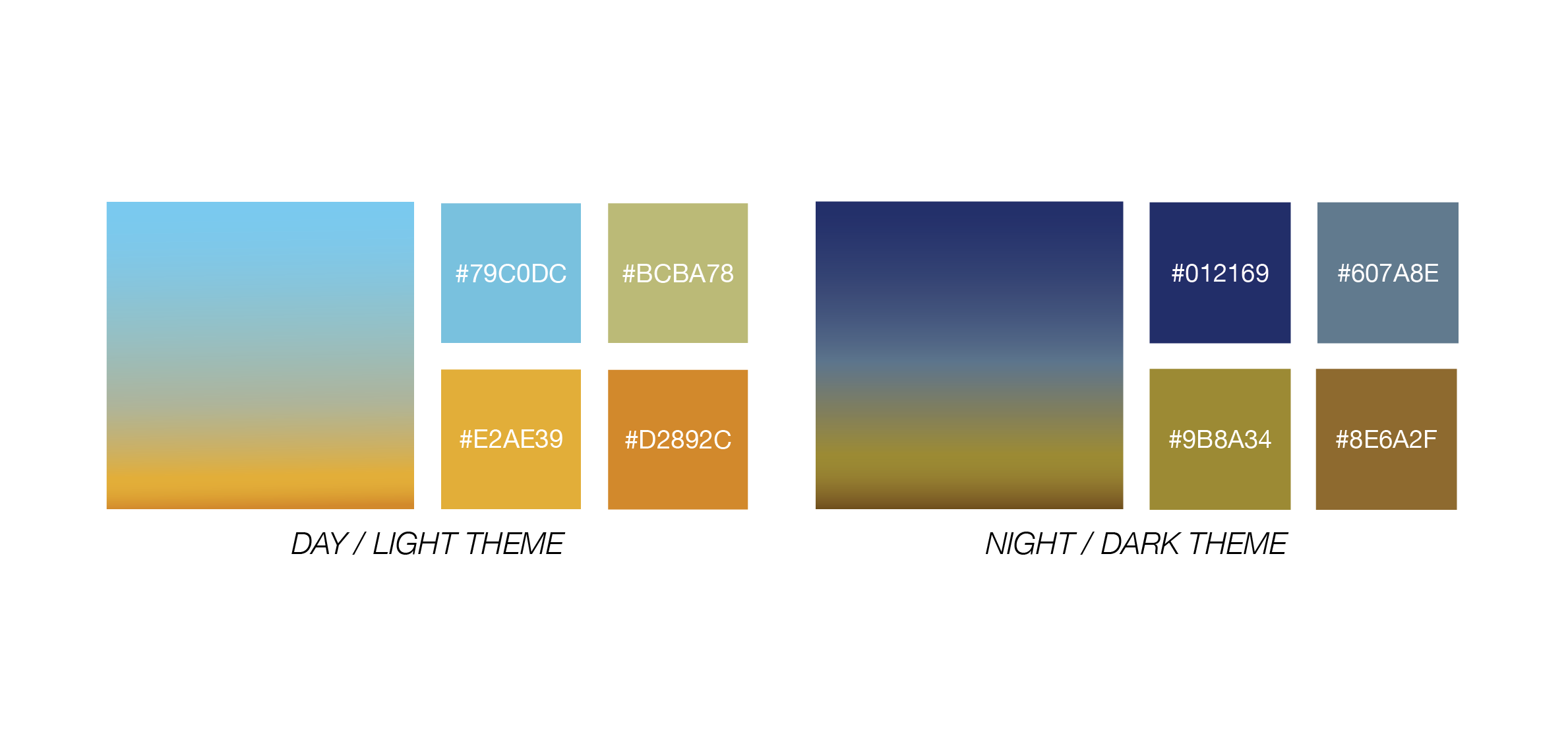
Elevate color palette

The Elevate theme features two complementary color palettes. The lighter palette moves from blue into warm yellow tones, while the darker palette uses deep blue and gold. Not only are these colors meant to evoke the hues of the sky, but blue is our company color, and the gold was also for our 50 year anniversary as a brokerage.

TYPOGRAPHY
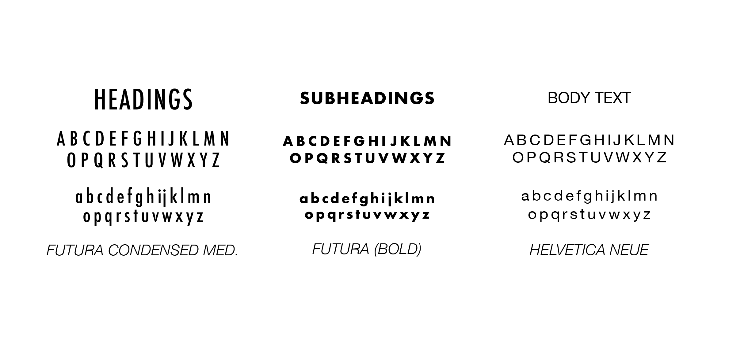
Elevate typography system

Futura was chosen for its modern, elevated appearance, while Helvetica provided a clean and highly readable supporting typeface.

VISUAL LANGUAGE
Elevate imagery and mood board

Skies, gradients, arrows and imagery suggesting height and upward movement helped establish the visual language for the campaign.

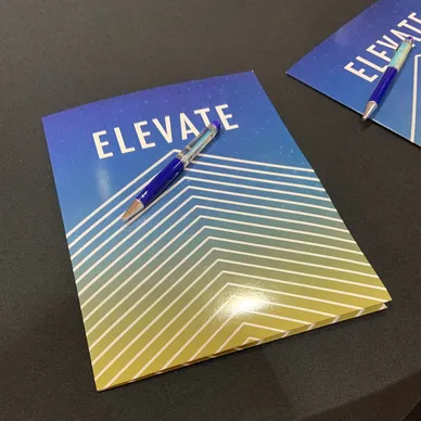
Elevate branded folders and promotional materials

Elevate-branded folders and promotional materials extended the identity beyond the awards event.

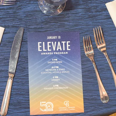
Elevate awards ceremony materials

The campaign branding was incorporated throughout the annual awards celebration.

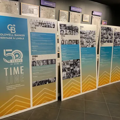
Elevate company history displays

Large-format displays used the Elevate visual system to showcase company history and 50 years of milestones.

EXPLORE THE IDEA BOOKS

View the complete publications to see how the Elevate identity carried through longer-form editorial design and agent resources.

A NEW YEAR. A NEW VISUAL STORY.

Soar

2025 · Awards + Idea Books

Soar branding campaign header

The next annual campaign was "Soar," built around flight, sky and aviation-inspired imagery.

The concept focused on momentum, possibility and helping agents continue moving upward while introducing a completely new color palette and typography system.
COLOR SYSTEM
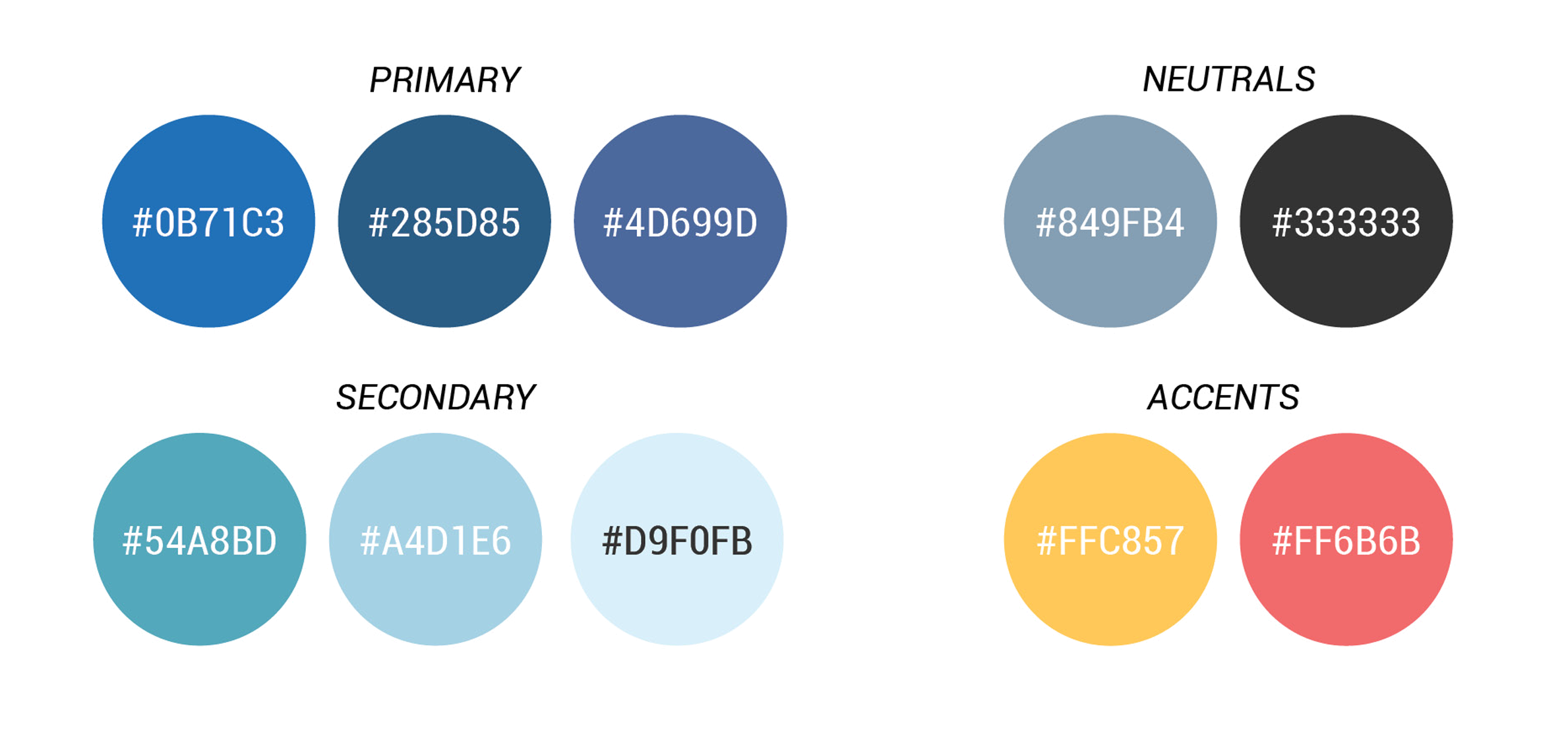
Soar color palette

Soar uses a light, airy palette inspired by open skies and movement. Blues form the foundation of the identity, supported by lighter tones that keep the campaign optimistic, energetic and forward-looking.
TYPOGRAPHY
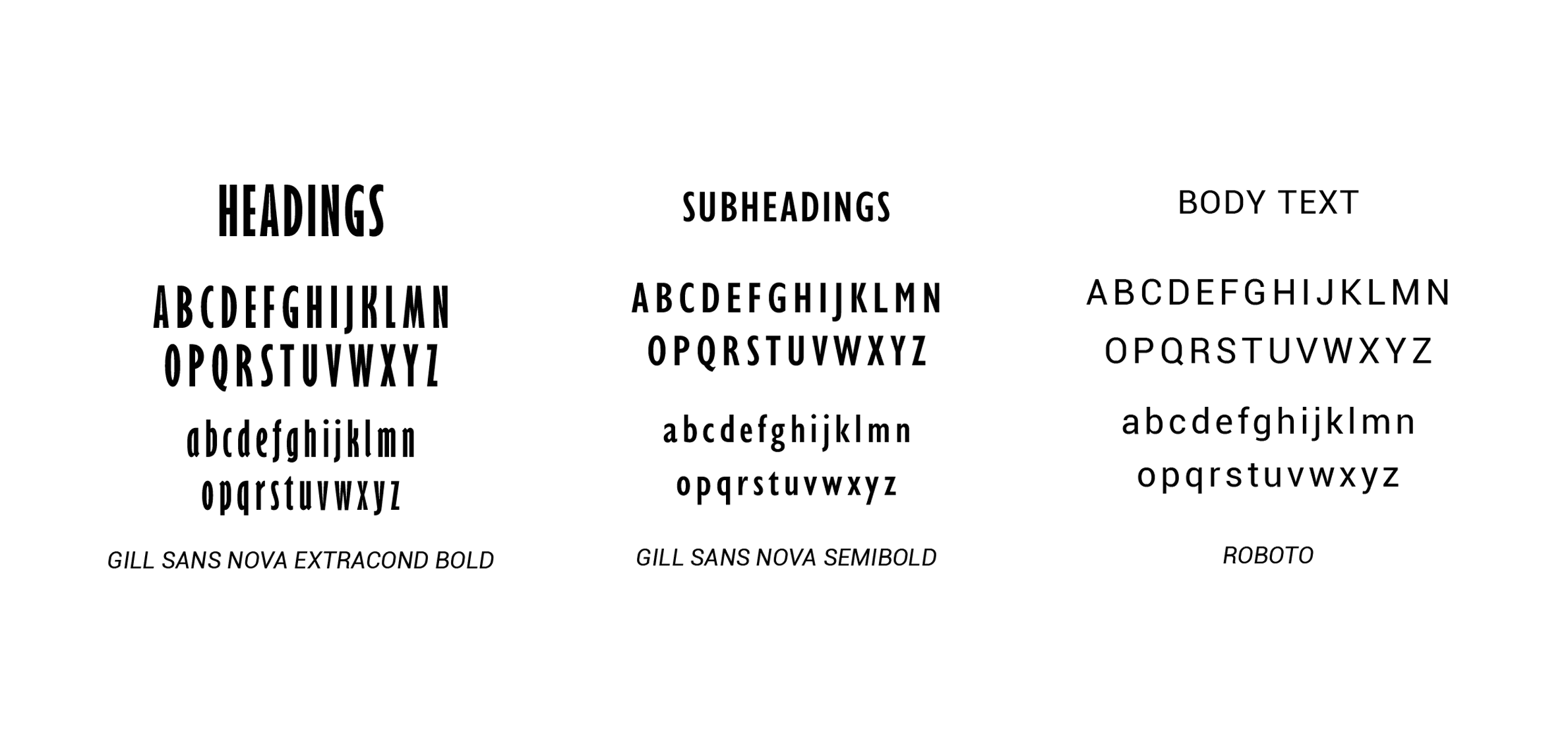
Soar typography system

The typography was selected to reinforce the campaign's sense of movement and possibility. Bold headline treatments provide impact, while supporting type remains clean and readable across event materials, print pieces and longer-form publications.
VISUAL LANGUAGE
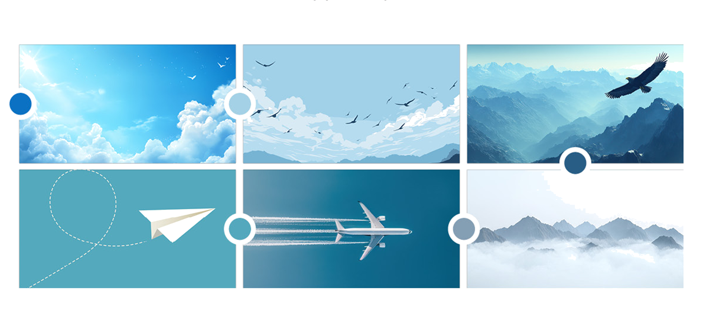
Soar imagery and mood board

Flight, clouds, open skies and upward motion shaped the visual language for Soar. These elements created a flexible system that could move from the awards celebration into the annual Idea Books and supporting marketing materials.
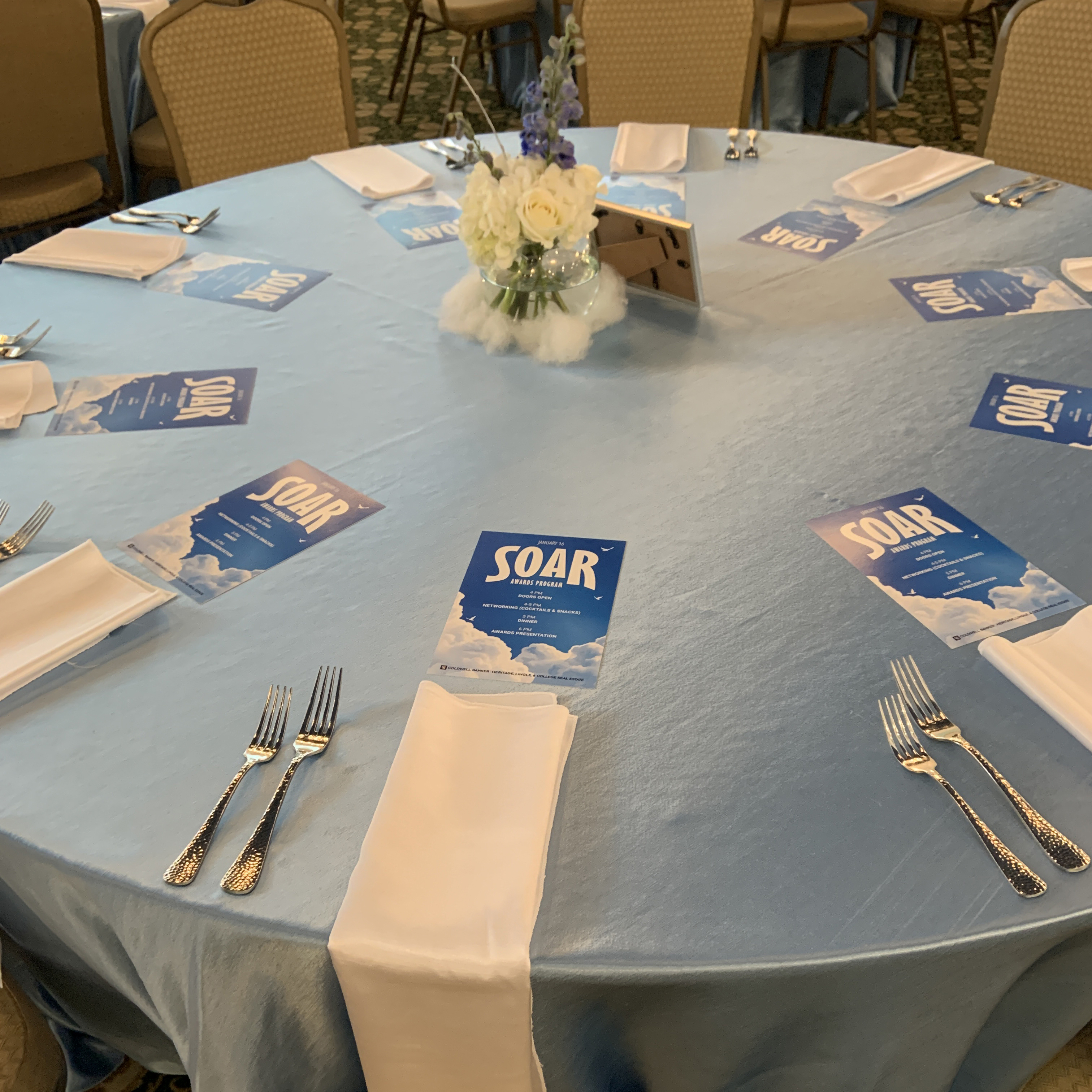
Soar event branding

Soar branding extended into the annual awards event through environmental graphics and supporting materials.
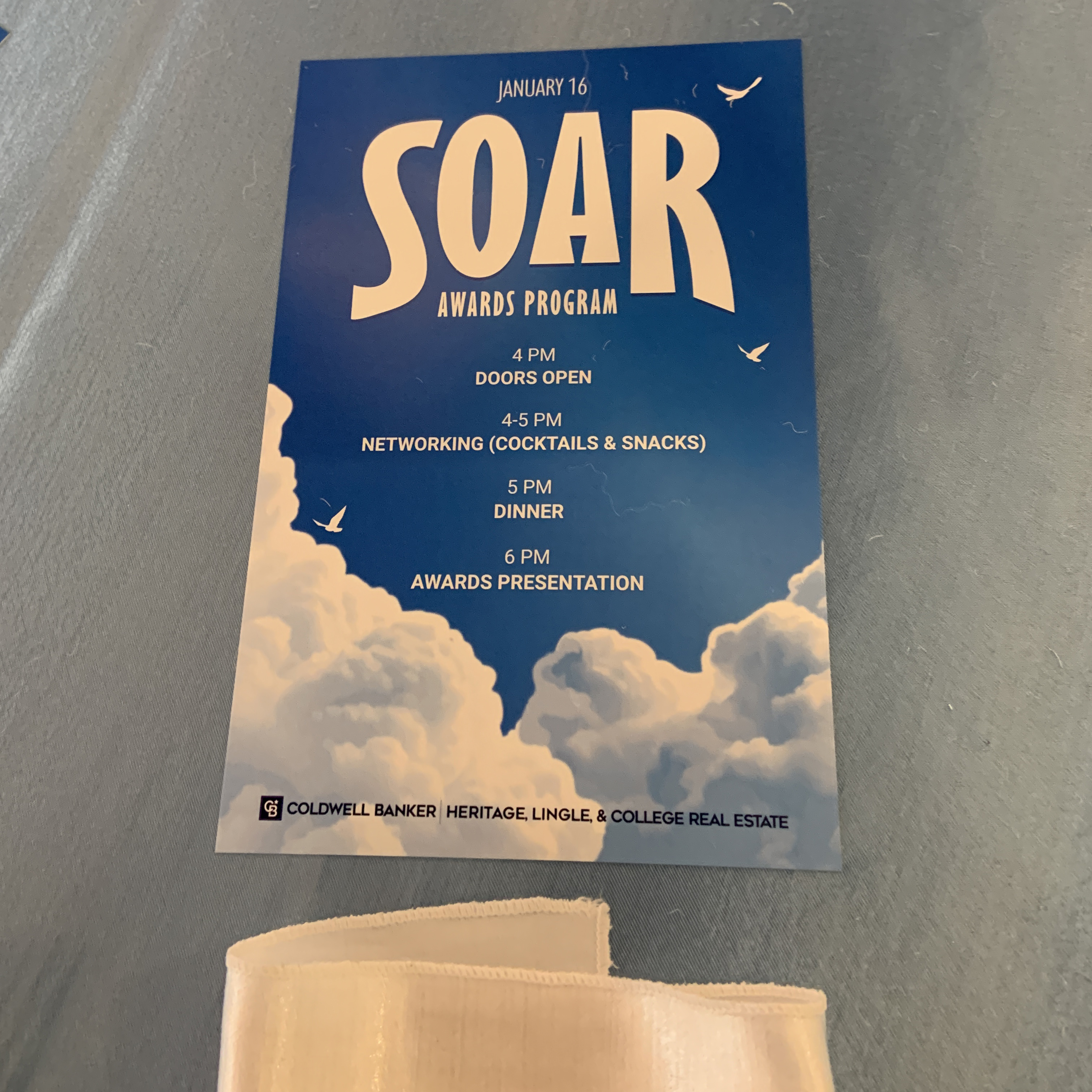
Soar awards materials

Event materials carried the flight-inspired visual system into the in-person celebration.
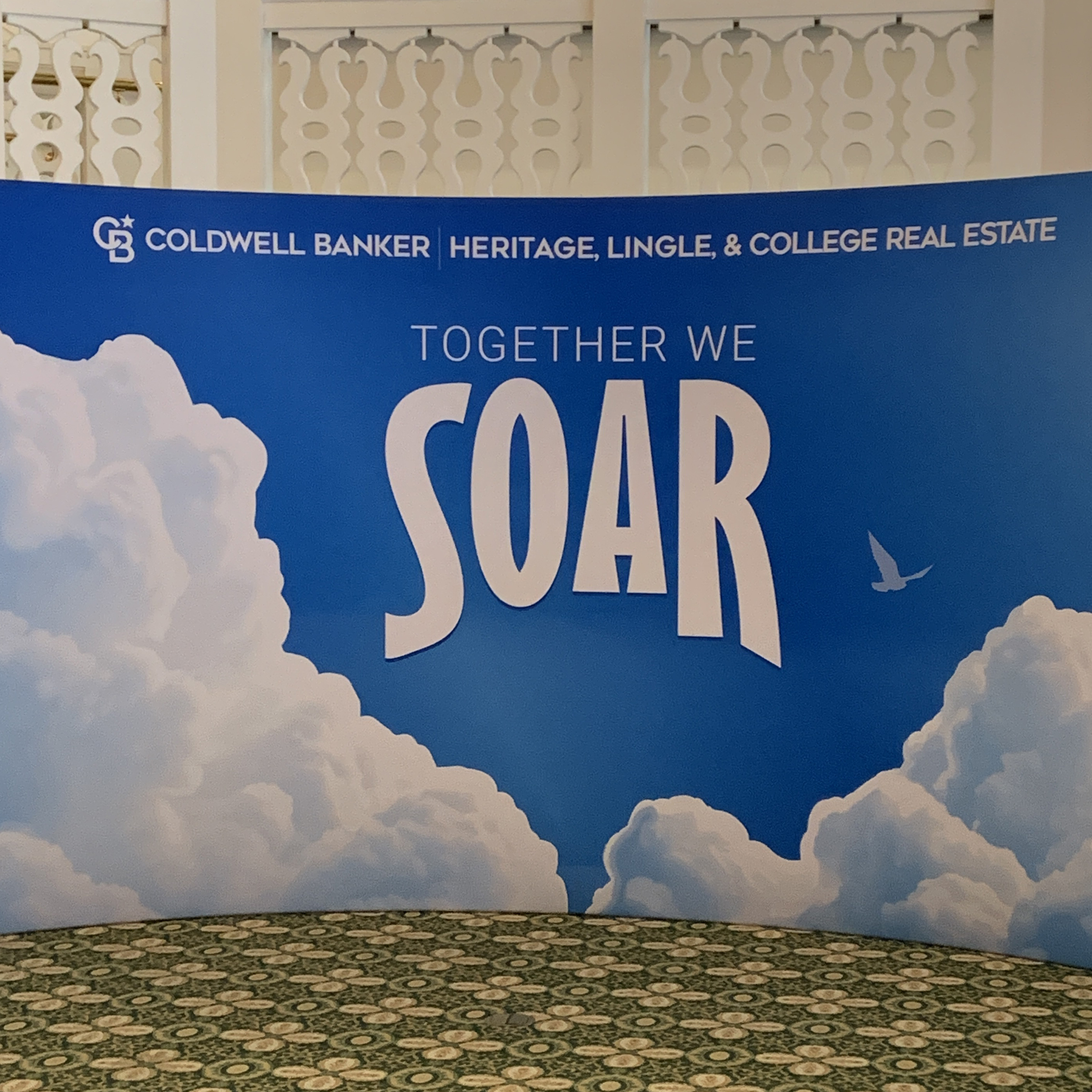
Soar campaign applications

Additional designs such as this large banner, meant as a backdrop for photos, helped reinforce the campaign identity across multiple touchpoints.

EXPLORE THE IDEA BOOKS

The Soar visual system continued through both annual publications, adapting the flight-inspired campaign to longer-form content.

SAME PURPOSE. COMPLETELY DIFFERENT PERSONALITY.

All In

2026 · Awards + Idea Book

All In branding campaign header

"All In" shifted the annual campaign into an entirely different visual direction.

Inspired by casinos, poker and classic gaming imagery, the identity was designed to feel sophisticated, celebratory and high-end.

COLOR SYSTEM
All In color palette

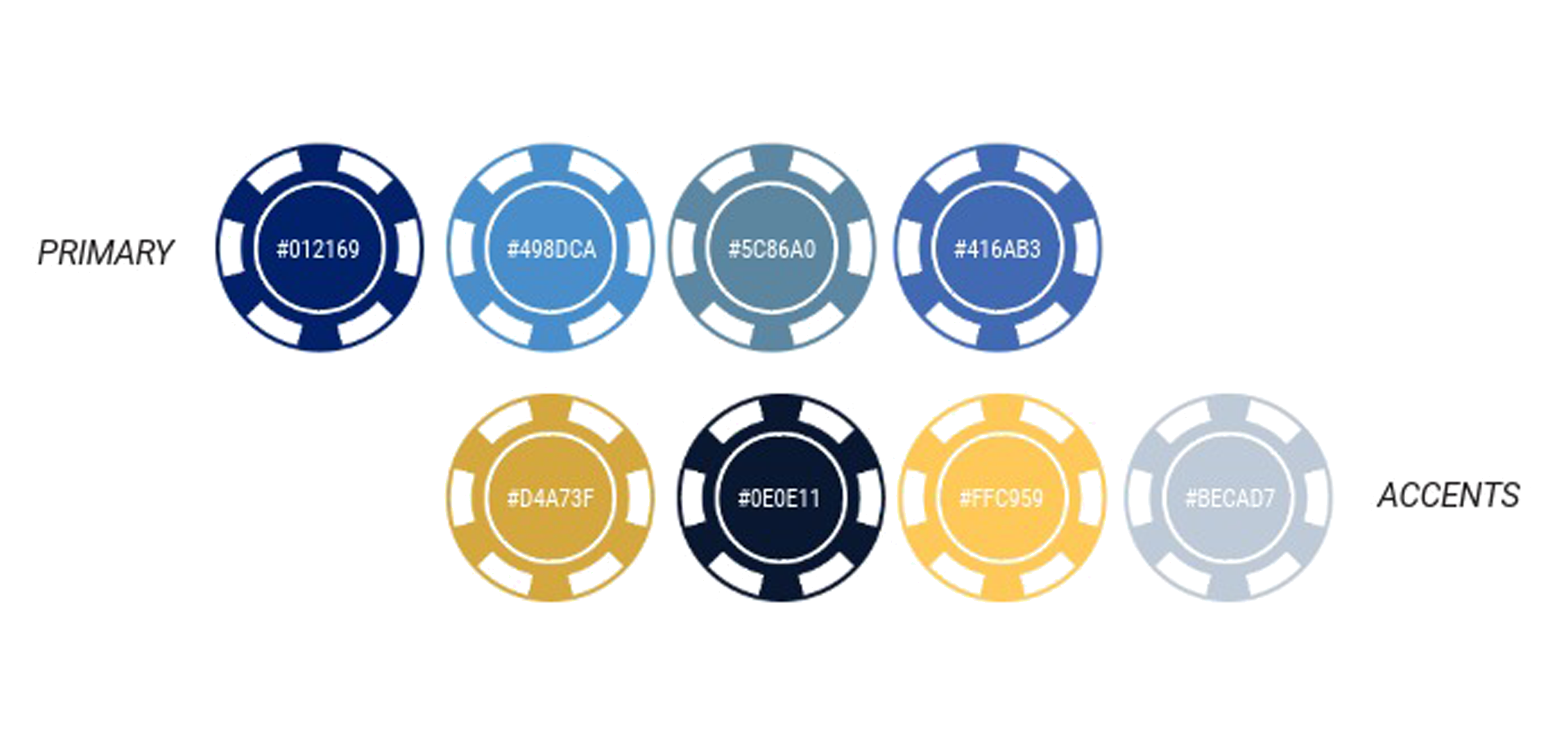
All In moved the annual campaign in a more sophisticated direction, drawing inspiration from classic casino and poker imagery. The palette was designed to feel rich and polished while still functioning across event graphics, print materials and digital applications.

TYPOGRAPHY
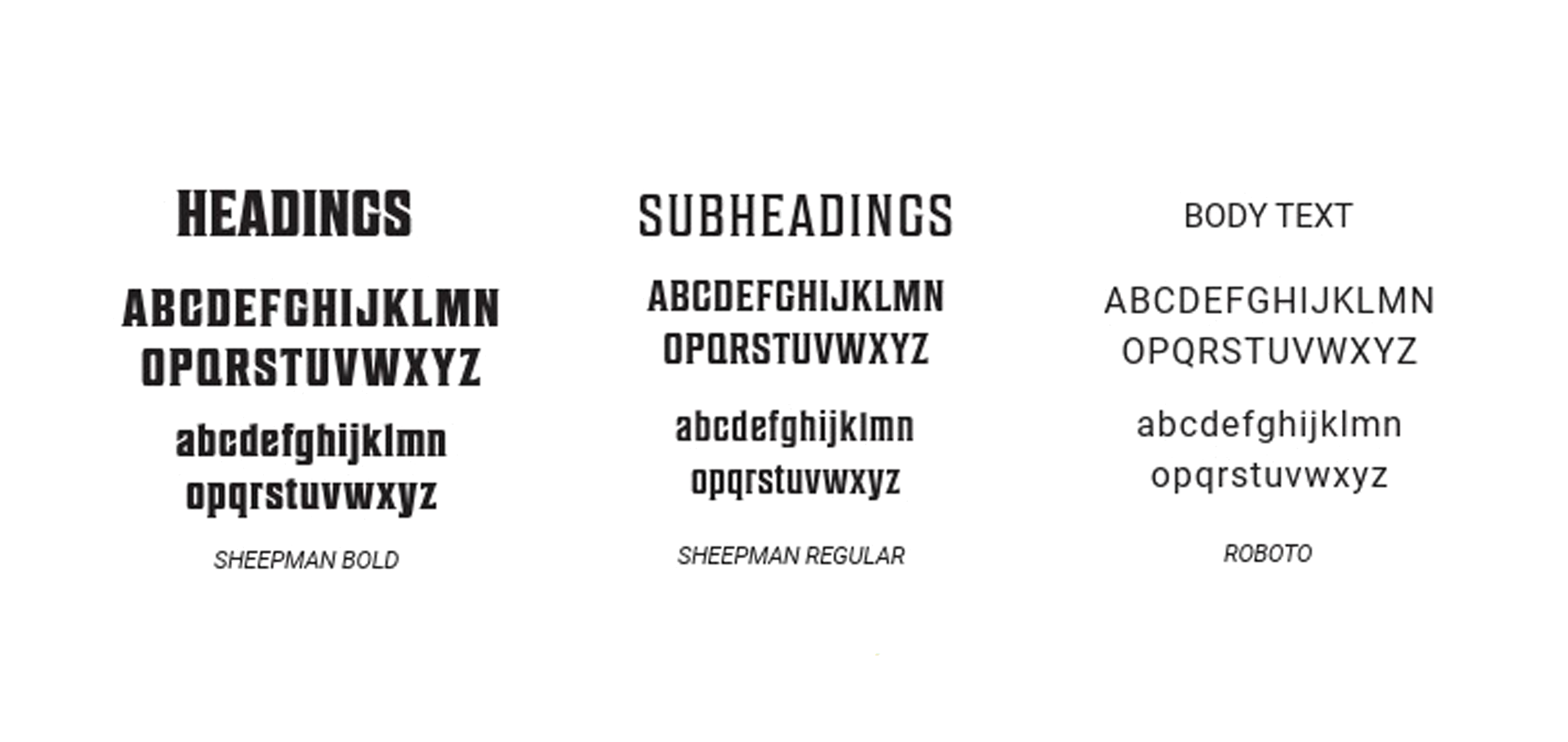
All In typography system

The typography pairs a more distinctive display style with clean supporting type, creating a balance between the personality of the casino-inspired theme and the readability required for larger pieces such as the annual Idea Book.

VISUAL LANGUAGE
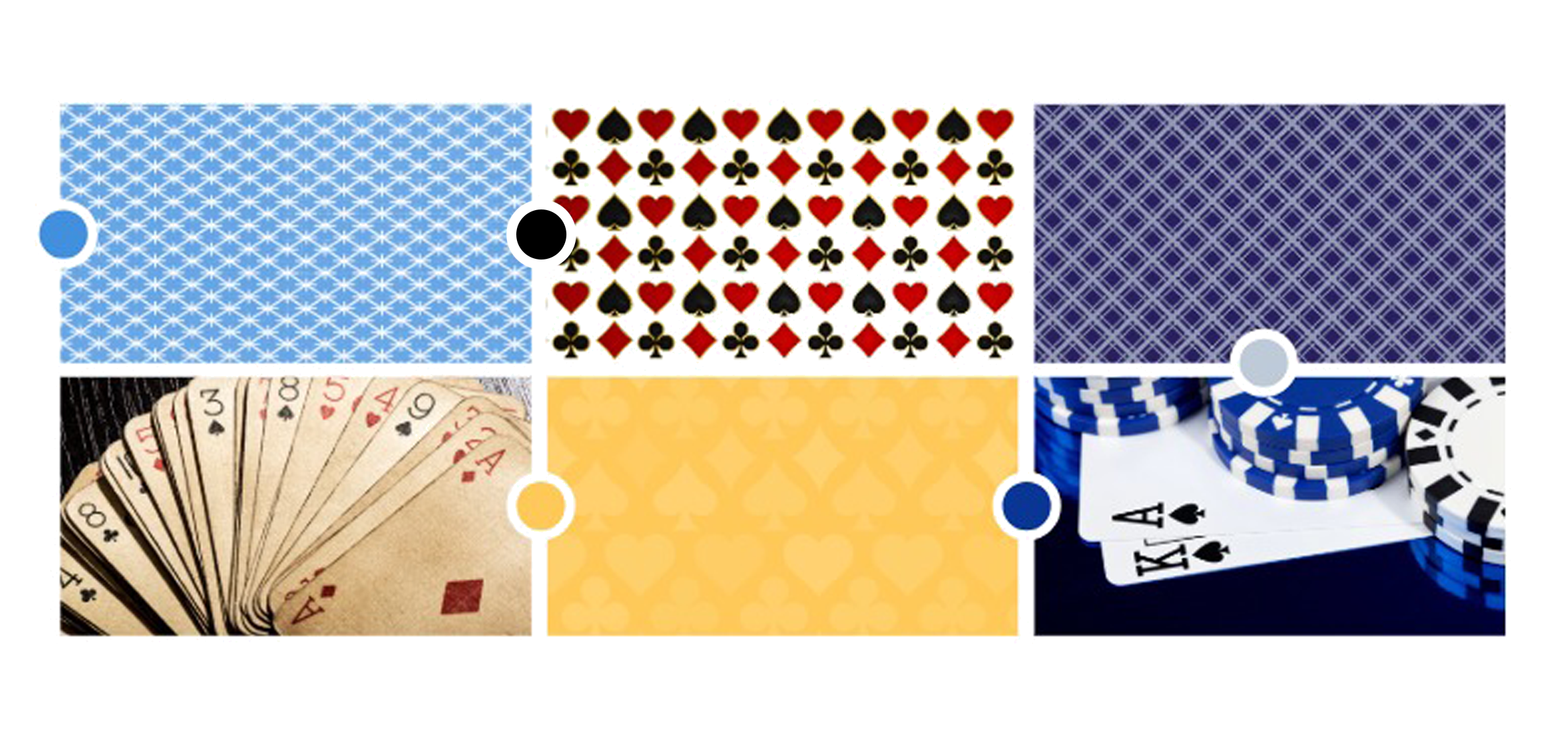
All In imagery and mood board

Playing cards, gaming tables, chips and other casino-inspired details helped establish the visual system. The goal was to reference the theme without becoming overly literal, keeping the overall presentation polished and celebratory.

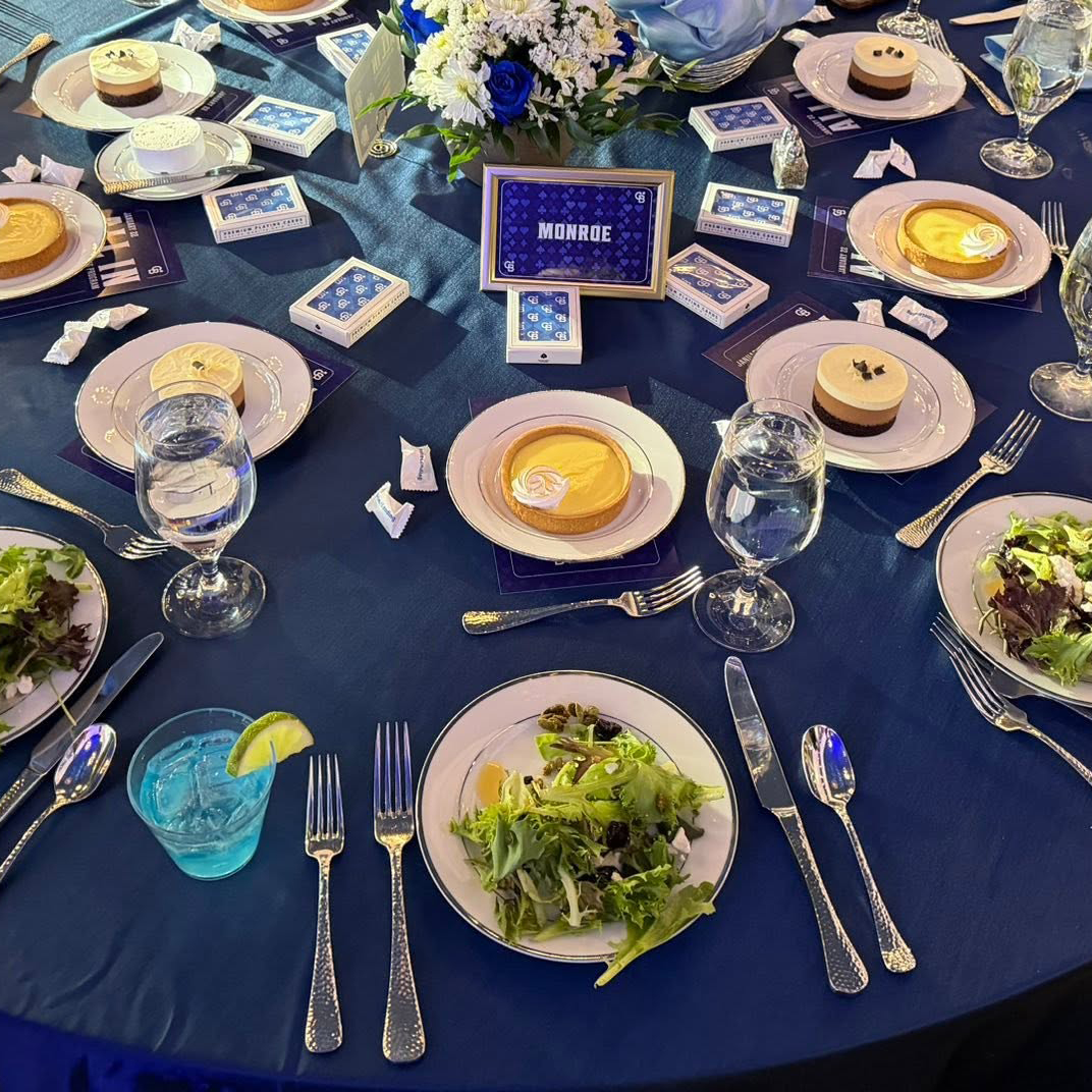
All In event branding

All In branding carried through the awards event with a polished casino-inspired visual treatment.

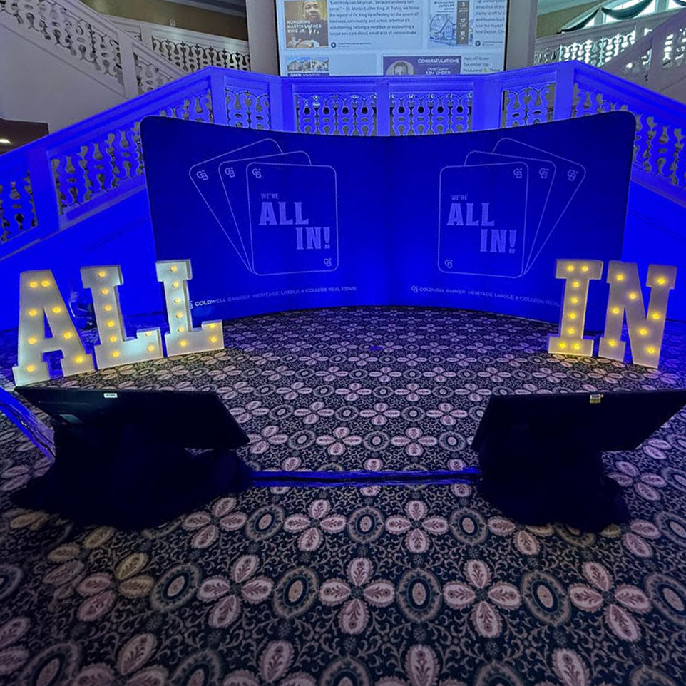
All In awards materials

Event materials like this large backdrop and supporting text cut-outs, extended the theme's visual identity.

All In campaign applications

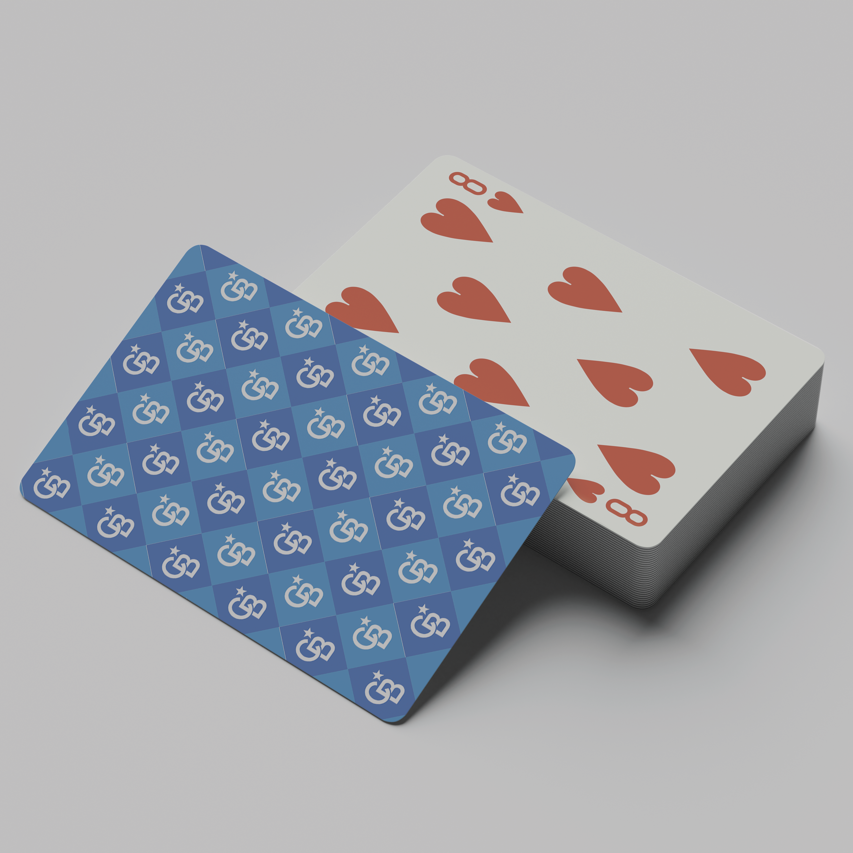
Supporting pieces like these custom designed playing cards helped maintain a cohesive look across the celebration and gave the agents a nice souvenir from the ceremony.

EXPLORE THE IDEA BOOK

The complete publication extends the All In visual identity into a longer-form editorial piece.